Mastering Web Layout Design: A Comprehensive Guide
Mastering Web Layout Design: A Comprehensive Guide
12 Jan 2020 18:01 (Updated for 2026 UX/UI Standards)
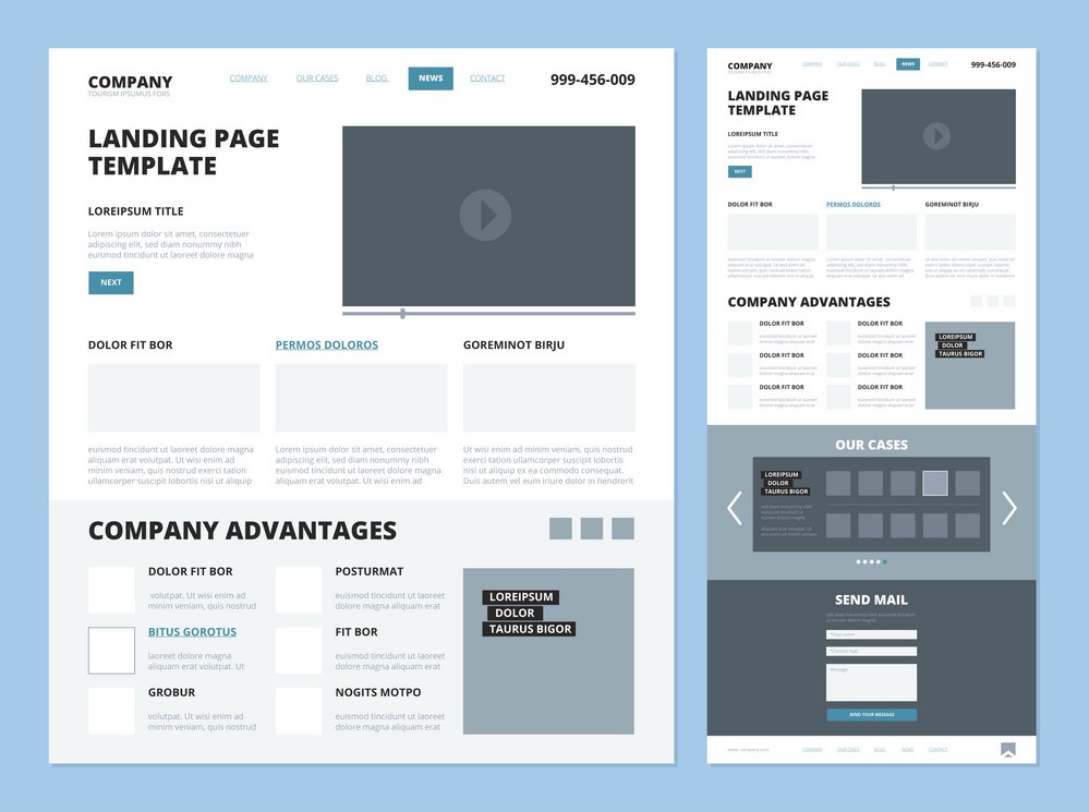
Choosing a layout for your website is a strategic decision. It must take into account your purpose, your audience, and your existing branding. While most websites use common building blocks—like headers, footers, and sidebars—the way you style and place these elements creates the unique "vibe" of your business.
🏗️ The Anatomy of a Modern Web Layout
1. The Header (Top-Bar & Logo Area)
The Top-bar is the prime real estate for contact info and social icons. Below it, the Logo Area usually features a left-aligned rectangular logo. In 2026, centering your logo is preferred for brand-heavy, creative industries, while left-alignment remains the standard for corporate utility.
2. Navigation (The Roadmap)
Your main menu should be concise—ideally 8 words or less. Whether it’s a horizontal bar or a mobile "hamburger" menu, high visual contrast is essential for readability.
3. Body Content & Sidebars
The top 1/3 of your page is the "above-the-fold" area. This is where search engines look for keyword-rich descriptions.
Sidebars: Best used on interior pages for Call-to-Actions (CTAs), testimonials, or secondary navigation.
Pro Tip: Right-aligned sidebars are generally preferred over left-aligned ones unless used for primary navigation.
4. The Footer & Sub-Footer
The Footer provides general company info and site maps, while the Sub-footer (the very bottom bar) handles the "legal" necessities: copyright notices, privacy policies, and designer credits.
🎨 Design Specifics: Color & Typography
Color Palette: Stick to a primary color and 2–3 harmonies. Always sample colors from your logo to ensure brand integration.
Typography: For the web, readability is king.
Body Text: Use Sans-Serif (Arial, Verdana, Tahoma) for clean reading.
Headings: Use Serif (Georgia, Times New Roman) to create visual differentiation.
The "Dark Grey" Rule: Avoid pure black text (#000). Use a dark grey (#333) to reduce eye strain for your users.
✅ Layout Best Practices for 2026
Grid Systems: Use a columnar grid system for consistent alignment.
Image Placement: Right-align images within text copy and ensure a 20px margin so text doesn't "hug" the image.
Bulleted Lists: Use them! People scan lists much faster than dense paragraphs.
Avoid Justified Text: Justified alignment looks terrible on mobile devices and creates "rivers" of white space that hinder readability.
Quality Control: Spell-check and grammar-check everything. Search engines actually lower the rankings of sites filled with errors.
Conclusion
The process of layout customization is simply recognizing how best to present your content. By observing the leaders in your industry and following these structural principles, you can create a site that is both beautiful and functional.
📐 Need a Layout That Converts?
Don't settle for a generic look. Our team at iFormatLogic uses advanced grid systems and psychological design principles to create layouts that guide your visitors toward a sale. Contact us at 047-611-1243 or visit https://iformatlogic.com/ to discuss your project.