What is Responsive Web Design?
What is Responsive Web Design?
23 Jan 2020 18:07 (Updated for 2026 Multi-Device Standards)
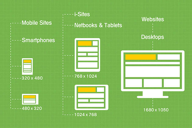
How can websites possibly keep up with the endless variety of screens out there? The answer is Responsive Web Design.
Responsive web design allows your website and all its pages to adapt and produce the most effective experience for users, whether they’re on a desktop, laptop, tablet, or smartphone. In today's market, if your site isn't responsive, you are essentially invisible to half of your potential customers.
📱 What is Responsive Web Design?
Responsive web design is an approach that allows websites to "render" (display) on all devices and screen sizes by automatically adapting to the hardware. Instead of building a separate "mobile version" of your site, you build one site that "responds" to the user's environment.
How Does It Work?
Responsive design uses Cascading Style Sheets (CSS) and Media Queries to detect the user's screen characteristics. It adjusts:
The Viewport: Telling the browser how to scale the page.
Flexible Grids: Elements are sized by percentages rather than fixed pixels.
Image Scaling: Images automatically resize so they don't "break" the layout on small screens.
🔍 Is Your Website Responsive?
You can test your site right now using these professional methods:
The Chrome Shortcut: * Open Google Chrome and go to your website.
Press
Ctrl + Shift + Ito open DevTools.Press
Ctrl + Shift + Mto toggle the Device Toolbar.You can now simulate any device, from an iPhone to a 4K monitor.
Google’s Mobile-Friendly Test: Use Google’s free online tools to see if your pages meet their "mobile-friendly" criteria for search rankings.
💡 Why It Matters to Business Owners
Responsive design isn't just about looking good—it's about the bottom line.
One Site, Every Device: You only have one website to manage, update, and host. No need to make changes twice.
Zero Redirects: Traditional mobile sites often "redirected" users to an
m.yoursite.comaddress. Responsive design eliminates this, making your site load faster and feel more professional.SEO Advantage: Google explicitly prefers responsive websites. One URL makes it easier for their bots to crawl and index your content, boosting your search rankings.
Cost-Effective: While the initial build requires expert planning, the long-term maintenance costs are significantly lower than managing multiple site versions.
Conclusion
Responsive web design is the backbone of the modern internet. It ensures that your brand’s message is clear and functional, no matter how your customer chooses to find you.
🌐 Need a Responsive Upgrade?
Is your current website frustrating your mobile users? With over 1,000 sites launched, iFormatLogic specializes in creating fluid, high-performance responsive designs that drive results. Contact us today at info@iformatlogic.com or visit us online at https://iformatlogic.com/.